Thank you for checking out my portfolio. I am in the process of updating these projects with more detail. If there are any projects in particular that you’d like more information on just message me and I’ll make that my focus. Thank you for your patience.
Category: Portfolio
Shelter Insurance Underwriting Intranet
Please note: This is only available to Shelter Insurance employees and I can’t post the wireframes, design, or any documentation publicly.
Overview:
I worked with the underwriting department at Shelter Insurance to complete a massive content migration from files in Word, PDF or Excel format stored in folders on a Windows Server to a content management system or Confluence.
Goal: To find the best application to host underwriting content then prioritize and organize content in an appealing and meaningful way for Underwriting employees.
Duration: The research aspect of this project took about a year and a half. Underwriting is a very large department and there were a lot of schedules and priorities to juggle.
Team: I worked with five Underwriting business analysts along with a committee of about 25 or 30 underwriting employees
My Role: UX Architect and Project Lead
Phases: This project consisted of two phases.
The first phase was helping underwriting to determine the best application to manage their content. I started with talking to the business analyst team about what they were hoping to achieve, why they were looking for a new solution, what their feature and functionality requests were, etc. I knew the most about Shelter’s customer facing website’s content management system (CMS) so I started off talking to them about the pros and cons of that CMS in comparison to their requirements. I then learned what the other options for hosting content were within the company and discovered there were four alternatives to the CMS I worked with. I set up demo meetings with the admins of each application to talk with the team of analysts. After the demos I created a spreadsheet of their requirements and marked off which applications met which requirements. This lead them to landing on two solutions to make up for weaknesses within each: A CMS paired with Confluence.
The second phase was the traditional UX research phase. This, of course, consisted of multiple steps.
First, I worked with the team of analysts to start in on a massive content audit. They put out the word to the department looking for volunteers to help with this. They ended up with a committee of about 25 to 30 people. I created multiple spreadsheets in Smartsheets with various columns for file name, location, and whether or not to Keep, Delete or Review. I then created a report to list the documents to keep, delete, or review. Once the audit was over, a few people went back and deleted the items marked for deletion and then the analysts reviewed the content that needed it and marked it to keep or delete. They got rid of over half their content – something like 25GB. It was awesome. I may have been even more excited about that than they were.
While the content audit was underway I created a survey for underwriting employees so I could learn about their frustrations with the current content storage system and also what worked about it.
I also started watching various underwriting employees. There are several roles within the underwriting department so I tried to watch at least one person in each role for half a day. I know watching more people for longer would have been better but I was working within the given limitations. I also recruited the front-end developer who would be building the site to observe as well so he could identify with the people he was building the site for a little more. This helped to build pretty good personas as well.
After this, the content audit had wrapped up (it took months) and I pulled in participants for card sorts. There was still a ton of content so I was working with representative content.
Once that was done and the sections and sub sections had been built I did a tree test study to make sure underwriting employees would be able to get to the information easily.
After the sections were established I started working with them on the design. I had them look at websites that they liked and explain why they liked them and then took the features that had the best justification and implemented them if they worked for their site. I created wireframes off of this and talked with the front-end developer throughout the process to get his feedback. I then demoed to the analyst team along with upper management to make sure everyone was happy with the direction of the site. After a few tweaks it was ready for testing. I pulled in a few underwriting employees to test the wireframe and after a few tweaks it was ready for development.
The front end developer started working on the project from there. I took on more of the project lead role at that time and kept in communication with the team of analysts while he worked. Asking them questions and getting clarification where we needed it.
Sadly, I ended up leaving Shelter before the site launched, but this was a fun project.
Say Insurance Customer Services
Please note: This is only available to Say Insurance employees and I can’t post the design publicly.
Overview:
I worked with this team to help build a policy change web application for Say Insurance’s customer service department and to make sure Salesforce was streamlined and as easy to use as possible.
Goal: Implement Salesforce and ensure that it was intuitive enough for relatively new Customer Services employees. The idea was to have it simple enough that they could easily complete tasks without much thought when a customer is on the phone so they could focus on that conversation. Due to high employee turnover in this department this would also help to reduce training. I also worked to ensure that an in-house application integrated well within Salesforce. I designed the in-house application and a couple of minor interfaces for Salesforce.
Duration: Testing Salesforce lasted about 6 months with usability testing occurring once every week or once every two weeks. I worked on the in-house application that was to integrate with Salesforce for two years.
Team: I worked with a Scrum team that included three developers and two Salesforce developers. I worked closely with the Product Owner and the Customer Services Team Leads as well as Customer Services Reps.
My Role: UX Architect
Research:
To kick the project off I interviewed the product owner, team leads and business partners to determine what the goals of the projects were.
I sat with Customer Services Reps once a week and watched them work to get an understanding of how they worked, what their current hurdles were, what worked well for them, etc.
I worked with the Customer Services Business Analyst to get reports on most common customer services calls and ongoing unsolved customer services issues.
Usability Testing: I was able to set up regular tests with the Customer Services Reps to quickly test wireframes or features and fixes that had been implemented in the last week or two. I set up observation rooms for anyone who was interested in observing. I worked with the the in-house application developers, the in-house Salesforce developers, and a Salesforce agency to try and implement any of the issues found during usability testing.
Shelter Insurance Social Media Content Library
Please note: This is only available to Shelter Insurance agents and I can’t post the designs publicly.
Overview: This is a website agents can go to to get social media posts that have been put together by Shelter’s marketing department.
My Role: When the project first started I was the Lead Front-End Developer but quickly became the UX Designer.
Goal: Provide an easy way for Agents to access social media posts created by Shelter’s Marketing Department. Agents were copying and pasting posts from a PDF and consistently making mistakes. Due to the location of the PDF, it was cumbersome for them to get to the content.
Duration: This project lasted about two years due to losing priority from management a couple of times.
Team: Since this project was so long the team consisted of myself, and three other front-end developers. Only two developers were working on it at the same time.
Research
I was given very little access to Agents for this project so I wasn’t able to research as much as I would have liked.
My attempt to hear from all Agents was to send out a survey. I asked questions about their likes and dislikes of the current system, how often they post to social media sites, what their motivation is for posting, etc.
Other than the survey I was given very limited access to the Agents so I spoke with the people who interacted closely with them. This consisted of Marketing Department employees. I talked to them about their conversations with Agents and asked them what information Agents needed to share, where they were making errors, and what the common complaints and compliments were for the current process.
The Problem
I discovered that The Agents were having a hard time copying and pasting from a PDF document, customizing the content, and weren’t able to access photos for their social media. As a result the following features were implemented:
Display a photo for the Agent to download easily.
Allow Agents to select which words in a sentence would be best for their particular situation. We determined that highlighting the customizable words and allowing them to simply click the word they wanted to use would be the easiest solution for sentence customization. Example: Call me| my office at XXX-XXX-XXXX.
Allow them to enter their contact information and save it in a cookie to allow for auto-filling in posts. Example: Call me at 573-639-9999
Provide an easy way to select and copy all the text after customization.
Allow them to filter based on social media platform and topic.
In speaking with Marketing it became apparent they were dedicating a lot of time to the social media posts. Due to this we decided to provide a section for guidelines, instructions and FAQs to reduce the amount of time Marketing had to spend talking with Agents..
Testing
I was not given permission to take anything to Agents to have them test. Since Marketing spoke with them the most, I tested the application with those who weren’t assisting throughout the development process. I also did some quick hallway tests with Shelter Insurance employees. I looked for employees who had experience posting to social media and had the same amount and type of insurance knowledge as Agents. These participants were as close to representative users as I could get.
Shelter Insurance Agent Intranet
Please note: As this is an intranet site it is only accessible to Shelter employees
- Worked with business partners for requirements gathering
- Worked with many departments and people to help with information architecture.
- Wireframing. This is a large site with three main sections. Each section contains about 10 pages on average that can then lead to additional pages.
- This was one of those intranet sites where some of the content wasn’t been looked at in years and nobody knew who owned it.
Shelter Insurance iOS App
- First project where I was able to start usability testing at the very beginning of development and continue until the (nearly the)end
- Prepared testing script and test plan
- Set up equipment to record tests
- Moderated users during usability tests
- Compiled notes from recordings of usability tests into spreadsheet to prioritize necessary changes
- Worked with iOS developer to implement changes based off of testing results
- Worked with iOS developer on UX and front-end design
Loan Pie
Please note: This project is still underway and has not yet launched
- Started off as principal UX architect and grew intro project manager over the course of two years
- Completed competitive analysis
- Created proto-personas
- Create fully interactive wireframes
- Onboard new employees
- Build user stories
- Use taiga.io for project management ticketing system
- Meet with client weekly for progress reports and demos
Shelter Insurance Public Site
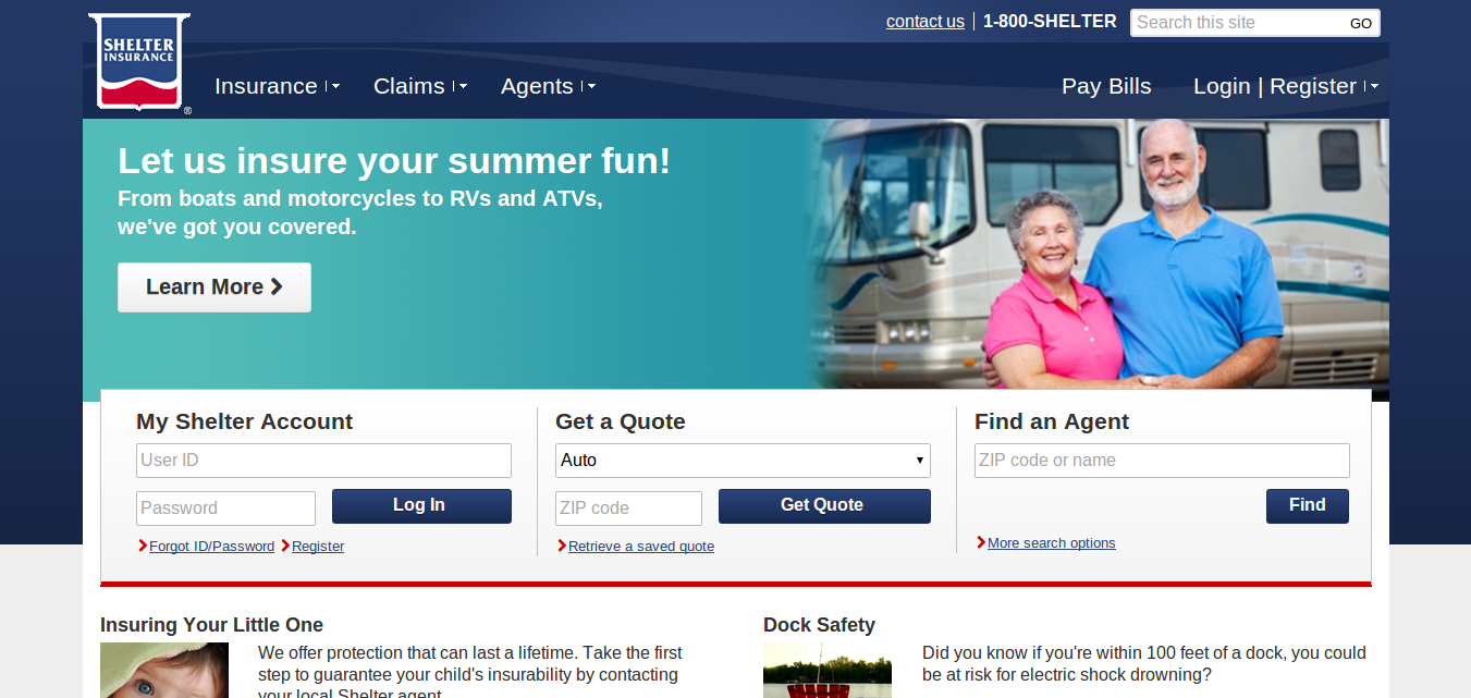
- Design and redesign based off of usability testing, wireframes and prototypes
- Backend user training
- CMS admin
- Communicate with developers to ensure website functions properly
- Iterate with coworkers on redesigns using protoypes and/or wireframes.
- Lead design brainstorming sessions with three to six people.
- Train and work with new hires on design and usability issues.
- Redesign or design and build subdomains, intranet sites, partner websites and sections.
- Work with developers and associates on front-end issues as necessary.
- Focus on the user experience for all projects. This includes activities like usability testing, surveys, analytics, etc
- Link: https://www.shelterinsurance.com/
Liberty Family Medicine
- Helped designers kick start design
- Coordinated with content writer for copy
- Focused on general UX best practices for site and gave feedback to developers
- Link: https://libertyfamilymed.com/
Mindful Movement Physical Therapy
- Met with client to gather requirements
- Lead team of five to launch the site
- Helped front-end developer start with design
- Focused on best usability guideslines throughout project
- Setup analytics
- Created training document
- Link: https://mindfulmovementpt.care/